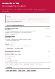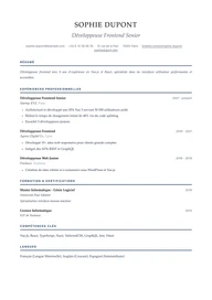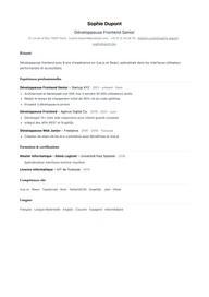
13 resume templates, ready for your next application

Pick the layout, Jobtae handles the content. Every template fills itself from your career history, then rewrites itself for each posting.

Build my resume for free

Free, no credit card.

What a resume template is for

A template will not get you hired, but it decides how your experience gets read. A consistent layout walks the recruiter's eye through your achievements in the order they expect: current role, experience, skills, education. All 13 templates below start from that principle. They differ in tone, in density and in how much room the skills section gets, never in reading logic.

On Jobtae the template is only a presentation layer. Your career history is captured once, then rewritten for every posting you answer. So you can switch templates afterwards without touching a single line of content, and compare two layouts on the same application.

Every preview is a real resume generated by Jobtae, not a mockup. Your document comes out with exactly this layout.

  • Classic

    Classic

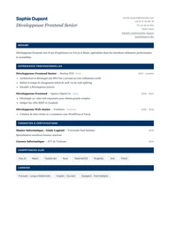
    A sober single-column layout set in Lato, with no ornament. Sections follow the order recruiters expect and every line stays readable by applicant tracking systems.

    When to pick it The default pick when substance matters more than styling, or when the posting runs through an ATS.

    Banking · Insurance · Public sector · Support functions

    See the Classic template
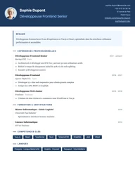
  • Minimal

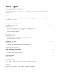
    Minimal

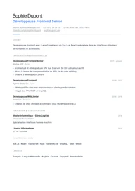
    Plenty of white space, body text in Inter and headings in EB Garamond. Nothing else: the layout steps back so the content can breathe.

    When to pick it Ideal when your track record is already dense and you want nothing pulling attention away from it.

    Consulting · Research · Publishing · Architecture

    See the Minimal template
  • Modern

    Modern

    Photo

    A two-column header with a photo, a midnight-blue accent and Raleway throughout. Contemporary without being loud.

    When to pick it Best when a photo is welcome and you want a current-looking resume that still respects your industry's conventions.

    Marketing · Sales · Human resources · Communications

    See the Modern template
  • Executive

    Executive

    Photo

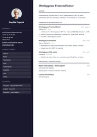
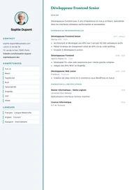
    A dark sidebar gathers the photo, contact details and skills while the main column lays out achievements. EB Garamond headings set the measured tone expected at this level.

    When to pick it Built for a senior or executive resume, where the career has to be legible at a glance.

    General management · Finance · Manufacturing · Consulting

    See the Executive template
  • Corporate

    Corporate

    A header split across two columns, Merriweather headings and an institutional blue. Rigorous structure, corporate tone.

    When to pick it Cut out for large companies and formal hiring processes that expect a by-the-book document.

    Enterprise · Legal · Audit · Energy

    See the Corporate template
  • Creative

    Creative

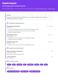
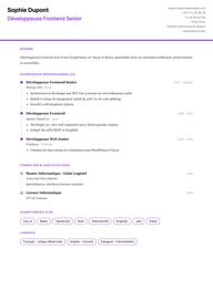
    Numbered sections, rounded Nunito shapes and a confident purple holding the page together. It stands out of the pile without giving up legibility.

    When to pick it For roles where presentation is part of the job and a graphic risk works in your favour.

    Design · Advertising · Media · Events

    See the Creative template
  • Elegant

    Elegant

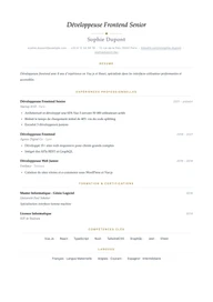
    Cormorant Garamond headings, hairline separators punctuated by a diamond and a gold accent. Quiet elegance, almost no bold weight.

    When to pick it When the resume should read as refined from the very first line, without overdoing it.

    Luxury · Hospitality · Culture · High-end real estate

    See the Elegant template
  • Tech

    Tech

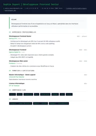
    Fira Code monospace for headings, skills as tags and a terminal green. This resume speaks the language of engineering teams.

    When to pick it Designed for a developer or engineer application with a technical stack to put forward.

    Software · Data · Cybersecurity · Infrastructure

    See the Tech template
  • Nordic

    Nordic

    An airy DM Sans grid, small-caps section titles and a cool blue. Scandinavian in spirit: clear, calm, functional.

    When to pick it A good middle ground when you want a designed resume that anyone can read, including outside your field.

    Product · Startups · Engineering · Education

    See the Nordic template
  • Slate

    Slate

    Photo

    A slate sidebar carries the photo, contact details, skills and languages; the main page stays white and dense, paced by a teal accent.

    When to pick it Handy when you have a lot of skills and languages to fit without making the resume longer.

    Project management · IT · Logistics · Healthcare

    See the Slate template
  • Timeline

    Timeline

    Experiences run down a vertical timeline: a date, a dot, an achievement. Career progression reads in three seconds.

    When to pick it Made for a linear, uninterrupted career where moving up role by role is the main argument.

    Engineering · Manufacturing · Public service · Retail

    See the Timeline template
  • Bold

    Bold

    An oversized Montserrat name, numbered sections and a red that runs edge to edge. A resume that owns the room.

    When to pick it Bring it out for a high-visibility role where the first glance has to land.

    Sales · Sales leadership · Communications · Sports

    See the Bold template
  • Academic

    Academic

    A long-form layout in EB Garamond with double rules and skills set as running text. Built to detail degrees, research and teaching without breaking the page.

    When to pick it The right pick for an academic application or a research dossier, where completeness beats brevity.

    Universities · Research · Healthcare · Teaching

    See the Academic template

Built to clear ATS filters

Most postings go through an applicant tracking system that reads your resume before any human does. A document built on decorative columns, with text locked inside images or nested tables, often comes out empty or scrambled. All 13 templates are generated as selectable text, with an explicit heading hierarchy and a linear reading order, including the ones that show a sidebar.

  • Genuinely selectable text, never a preview baked into an image.
  • Sections named with the headings applicant tracking systems look for.
  • A single reading thread, even on the sidebar templates.
  • Standard Google fonts, no exotic glyph and no icon carrying meaning on its own.

PDF and DOCX export

Every template exports to both formats from the same screen. PDF keeps the layout pixel for pixel and stays the format to send whenever nothing forbids it. DOCX is there for recruitment agencies and job boards that require a Word file, or when you want to reword a sentence before sending. Switching format changes neither the content nor the pagination.

PDF
Faithful layout and controlled pagination, ready to send or to print.
DOCX
An editable Word file, handy when the recruiter or the platform asks for one.

How to choose your template

When in doubt, start from the industry you are targeting rather than from your own taste. These four questions settle it fastest.

Is the industry formal?
Banking, legal, manufacturing, public sector: stay on Classic, Corporate or Academic. A communications agency will happily take Creative or Bold.
Is a photo expected?
Common in France, often discouraged elsewhere, and banned by some US employers. Three templates reserve a clean slot for it; the others do without and leave no gap.
Is your career history dense?
Past ten years of experience, prefer Minimal, Timeline or Executive, which rank the roles without cramming the text.
Is the role technical?
Tech and Slate pull the skills into the first third of the page, right where a technical recruiter goes looking for them.

Your resume, in the template that fits you

Tell your career story once. Jobtae adapts it to each posting and lets you switch templates whenever you want.

Build my resume for free