Minimalist resume template
Almost nothing on screen, everything in the text. The minimalist template removes the layout so only your experience is left.
Free, no credit card.
- When to pick it
- Ideal when your track record is already dense and you want nothing pulling attention away from it.
- Industries
- Consulting · Research · Publishing · Architecture
Who this template is for
This template is for careers that do not need selling by the artwork: ten years of experience, recognisable assignments, employers who speak for themselves. Consulting, research, publishing, architecture — fields where the writing is judged and where an over-decorated page reads as an admission. If you are torn between templates because none of them feels discreet enough, this is the one. It also suits career changers, where you want the reader to stop on the summary rather than on the chronology.
How the layout is built
A single column, but one that breathes: margins are wider than on the classic and sections are separated by empty space rather than by a rule. The header gives your name, the target role and a contact line. In the experience entries, the role and the dates sit at either end of the same line, the company and location drop to the line below, then the bullets follow. Body text is Inter and headings are EB Garamond: a serif against sans-serif contrast that structures the page without adding a single colour.
With or without a photo
No photo, by design. The whole point of the template is to strip out anything that is not information, and a portrait would take up a quarter of the header. For a resume with a photo in an equally calm spirit, look at Modern or Nordic.
ATS readability
Minimalism works directly in favour of automated parsing: one text flow, standard section headings, no column to reorder and no icon to interpret. The wide margins have no effect on extraction, and the serif against sans-serif contrast is purely visual — both are common Google Fonts whose characters are read without substitution.
PDF and Word export
The PDF renders exactly what you see, including the generous white space, which is most of the design here. In DOCX the file stays very clean since there is no column and no coloured background to reproduce; only the spacing may tighten by a point or two depending on your version of Word.
Closest templates
If this one is not quite right, these three play in the same register.
All resume templates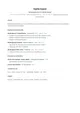
Classic
A sober single-column layout set in Lato, with no ornament. Sections follow the order recruiters expect and every line stays readable by applicant tracking systems.
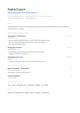
Nordic
An airy DM Sans grid, small-caps section titles and a cool blue. Scandinavian in spirit: clear, calm, functional.
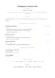
Elegant
Cormorant Garamond headings, hairline separators punctuated by a diamond and a gold accent. Quiet elegance, almost no bold weight.
Ready to fill the Minimal template?
Paste the posting, Jobtae rewrites your track record to answer it, then exports it in this template as PDF or Word.