Classic resume template
One column, sections in the expected order, no decoration. The template to pick when the resume simply has to read fast and well.
Free, no credit card.
- When to pick it
- The default pick when substance matters more than styling, or when the posting runs through an ATS.
- Industries
- Banking · Insurance · Public sector · Support functions
Who this template is for
The classic template is for applications where the layout should not be noticed, and where a graphic flourish costs more than a lack of originality. Banking, insurance, the public sector, support functions: in those fields a recruiter opens thirty resumes a day and looks for one specific fact in one specific place. It is also the template to send with a speculative application, or for a posting published on a platform whose processing chain you know nothing about.
How the layout is built
Everything sits in a single column. The header gathers your name, the target job title and a compact contact line: address, email, phone, LinkedIn, website. Then come the summary, experience, education, skills and languages, always in that order. Each experience puts the role in bold, followed by the company, the dates and the location on the same line, before the achievements as bullets. Skills and languages appear as plain tags. The type is Lato, a neutral sans-serif, and the black accent colours nothing but the section headings.
With or without a photo
No photo, deliberately: the classic is the template you send to countries and companies where a portrait is discouraged, or stripped out by the hiring policy. If you do want one, the Modern and Slate templates are built around it.
ATS readability
This is the safest template in the catalogue in front of an applicant tracking system. A single column means a single reading order: the parser receives the blocks in the order you wrote them, without guessing which column comes first. The section headings use the wording those tools look for, the text stays selectable, and no information is locked inside an image or a table.
PDF and Word export
On export, the classic is the one that survives the Word conversion best: with no sidebar and no boxed panels, the DOCX comes out almost identical to the PDF and stays editable line by line. The PDF keeps the exact pagination of the preview, including on a resume that runs to two pages.
Closest templates
If this one is not quite right, these three play in the same register.
All resume templates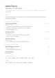
Minimal
Plenty of white space, body text in Inter and headings in EB Garamond. Nothing else: the layout steps back so the content can breathe.
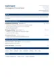
Corporate
A header split across two columns, Merriweather headings and an institutional blue. Rigorous structure, corporate tone.
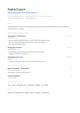
Nordic
An airy DM Sans grid, small-caps section titles and a cool blue. Scandinavian in spirit: clear, calm, functional.
Ready to fill the Classic template?
Paste the posting, Jobtae rewrites your track record to answer it, then exports it in this template as PDF or Word.